2018 - Build your online business

Wednesday, January 24, 2018

The best Free Frameworks to start your own Landing page on Wordpress


If you just started in wordpress development these frameworks will be the best selection for WordPress starter themes for theme developers.

Understrap

The Bootstrap 4 + WordPress Theme Framework

Free download here

FoundationPress

the ultimate WordPress starter-theme built on Foundation 6 by Zurb.
Free download here

HTML5 + boilerplate

An open source boilerplate theme for WordPress
Free Download here

WP RootStrap

WP RootStrap is a flat and minimal design theme powered by TwitterBootstrap 3.0. It has unique designed for SEO optimization with faster page loading. It can be used as a started theme for development of any website. It has lots of theme hook to help developer for further development. The flat look starter theme having a lot of theme functionality to manage logo fav icon and social media profile etc. The theme can be used for any kind of blog or news websites. This is fully responsive theme, works perfectly with any mobile devices or tablet.


Tuesday, January 23, 2018

Contact form for Landing Page


If you build a website with MODx m you may need a good quality contact form for your website


Contact form for Landing Page free download -

WEBBPLATSER LANDNINGSSIDOR SEO
Modal Contact for Landing Page

Tuesday, January 2, 2018

4 Bootstrap Gallery Templates
 Download
In this post we would like to share with you 4 awesome image gallery templates for Bootstrap 3. Just like all our freebies, these templates are completely free to use (no attribution required), fully responsive, and super easy to implement - just copy and paste!

The Templates

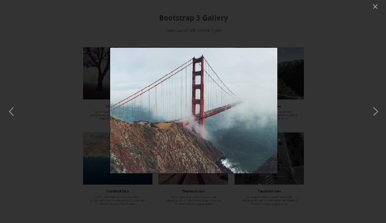
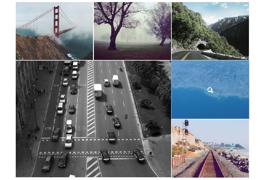
The four templates use the Bootstrap 3 grid for their layouts. The HTML is fully compliant with the framework and follows the recommended practices. For styling we've used good ol' CSS, while making sure to keep it self contained so it won't mess up the rest of your styles.
Each template has unique CSS-only hover effects, as well as Lightbox functionality thanks to the baguetteBox.jsplugin. There are many other Lightbox libraries out there but we chose that one because of the cool name (although it having no dependencies and being super easy to use were taking into account as well).
baguettebox.jpg
The BaguetteBox Plugin In Action

How to use

To use any of the templates from the demo, follow these simple steps:
  1. Grab the zip archive from the Download button near the top of the page and extract it.
  2. There are separate folders for each template + a folder of placeholder images (courtesy to Unsplash). Decide which template you want and grab it's HTML from the .tz-gallery element in the index.html file.
  3. Paste the HTML into your project. Make sure you have Bootstrap 3 on that page.
  4. The styles are located in separate CSS files for each design. Link to the CSS file or copy its contents and add them to your styles.
  5. For the Lightbox effect add the baguetteBox CSS and JS, and initialize it in a script tag - baguetteBox.run('.tz-gallery');.
fluid-gallery-1.jpg
Gallery Template With Fluid Layout

Free for Commercial Use

You have all rights to customize and use these templates in both personal and commercial projects. All our freebies are 100% royalty free, no attribution required (our license page). Enjoy!

5 Easy Ways to Modify Your Bootstrap Button Styles


In the following tutorial, we’re going to show you 5 easy ways to modify your Bootstrap button styles. This is a quick and easy way to differentiate your site from the default Bootstrap look. 
If you like what you see, you can download our free Bootstrap button pack (Demo | Download).

Initial Setup

We modified the default Bootstrap .btn class with the following CSS styles. These styles are only required if you’re looking to achieve the same look and feel as our button pack. Otherwise, you can stick with the default Bootstrap styles for now.
Now that we’ve modified our .btn class, let’s go over our custom button classes.

Sharp Buttons

To create sharp buttons, simply set your border radius to 0.

Outline Buttons

The first step in creating an outline button is to remove the background. Since we’ll be increasing the border width, you also need to reduce the button padding. Otherwise, your button will appear oversized.
Next, you need to increase the thickness of the border and change the color to match the border.
Finally, you can add some hover effects by modifying the color and border colors when hovering over the button.

Gradient Buttons

With gradient buttons, you’ll need a starting and ending color. While a typical linear gradient starts with one color and fades to another, this example has a hard shift in color halfway through the button. You’ll notice all the different lines we’ve added and that’s simply for compatibility across older browsers.
Next, we lighten the buttons when hovering over them.
Finally, we darken the buttons when they’re active/clicked.

Rounded Buttons

To get the rounded look, simply increase the pixel size on the border radius.

Raised Buttons

First, you need to create a box shadow to give the effect that the button is raised.
Then, you need to remove the box shadow and modify the margins when the button is activated.

Download The Button Pack

I hope you found this tutorial helpful. If you liked these button styles, make sure to download the button pack.